We really enjoyed the opportunity to team up with the Peach State Pride brand to expand and re-envision the their space in downtown Watkinsville, GA. Retail units can feel kinda blah with "builder beige" paint and acoustical ceiling tiles, so we set out to create a store that spoke more to the identity of their brand.
After spending some time with the Peach State Pride team and learning about their company, I quickly saw that this was a company truly built on pride (or more like overflowing-esteem-and-pure-LOVE) for the state of Georgia. This was not obnoxious fandom. This was a respect and admiration for a place that has a rich history and celebrated culture. I was kind of amazed at their love for Georgia history and impressed with their knowledge of the state's businesses, economy, and even interest in small towns that scatter across the land. It is always refreshing to find someone with true passion! Ok-- so now you get it--they love the peach state. From there, we discussed the feeling that they wanted the store to embody. Some features that were important: rich history, southern charm, and a casual, yet refined, atmosphere.
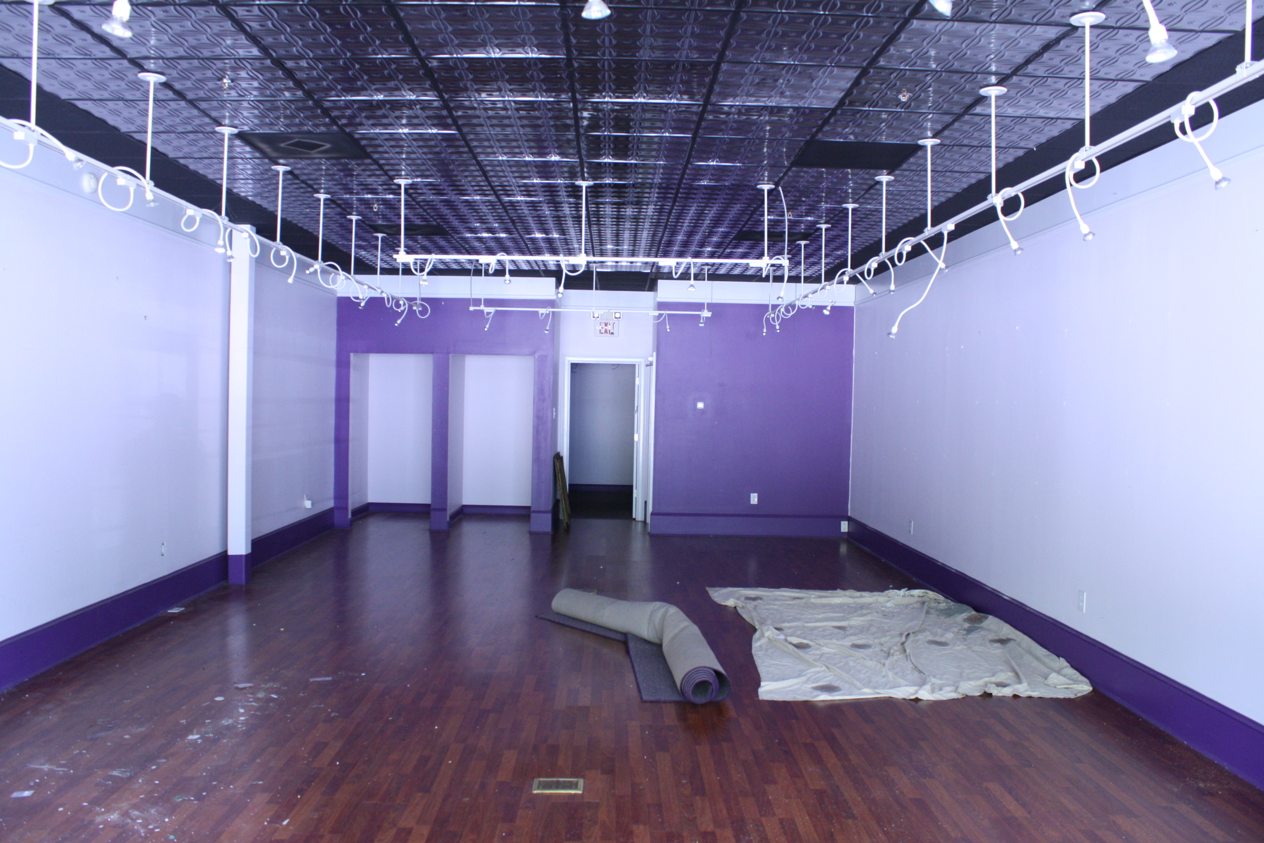
The shop already occupied a retail space, and they were looking to expand into the unit next to them as well. It was exciting to get to double the size of the store, but making a seamless transition between the two units meant both needed to just start from scratch. The two spaces looked a little different as you can see below...
TWO ORIGINAL UNITS:

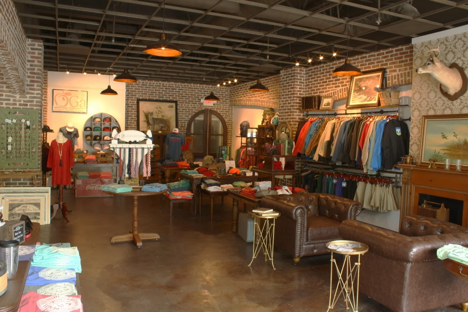
Brick. It became a "must have" for this project. The brick gave a rich texture and color and really added to the old southern charm of the space. We used it to create columns and arches that gave the space a rhythm and connected the two combined units. We know we aren't fooling anybody-- this building was not built in the 1820's-- but the brick really did make the space feel older, more substantial, and more established.
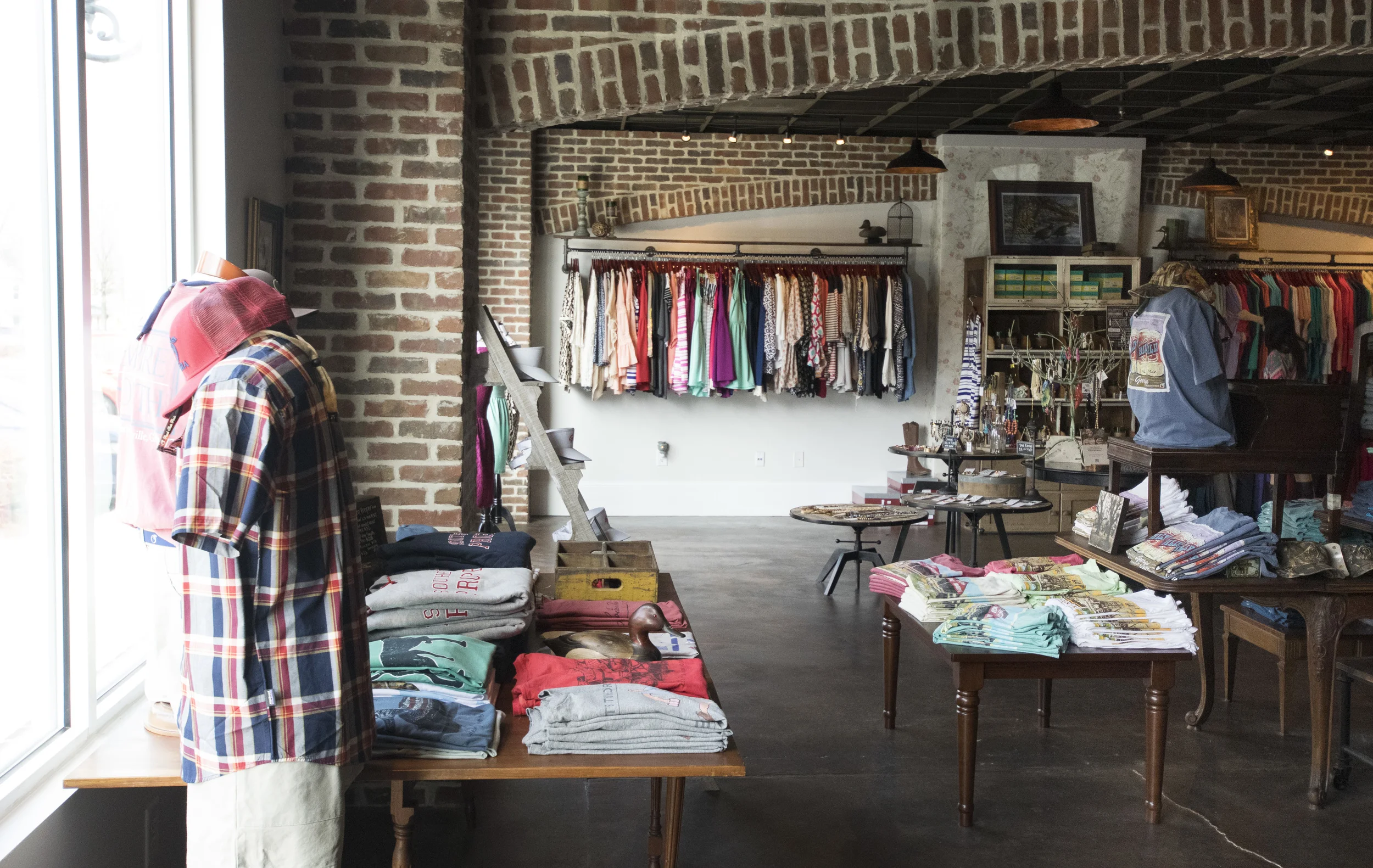
The ceiling and floor provided other opportunities to unify the two spaces. We removed all of the ceiling tiles and painted the exposed structure above. For the floor, we removed the mismatched laminates and chose a rich, brown stain for the concrete.
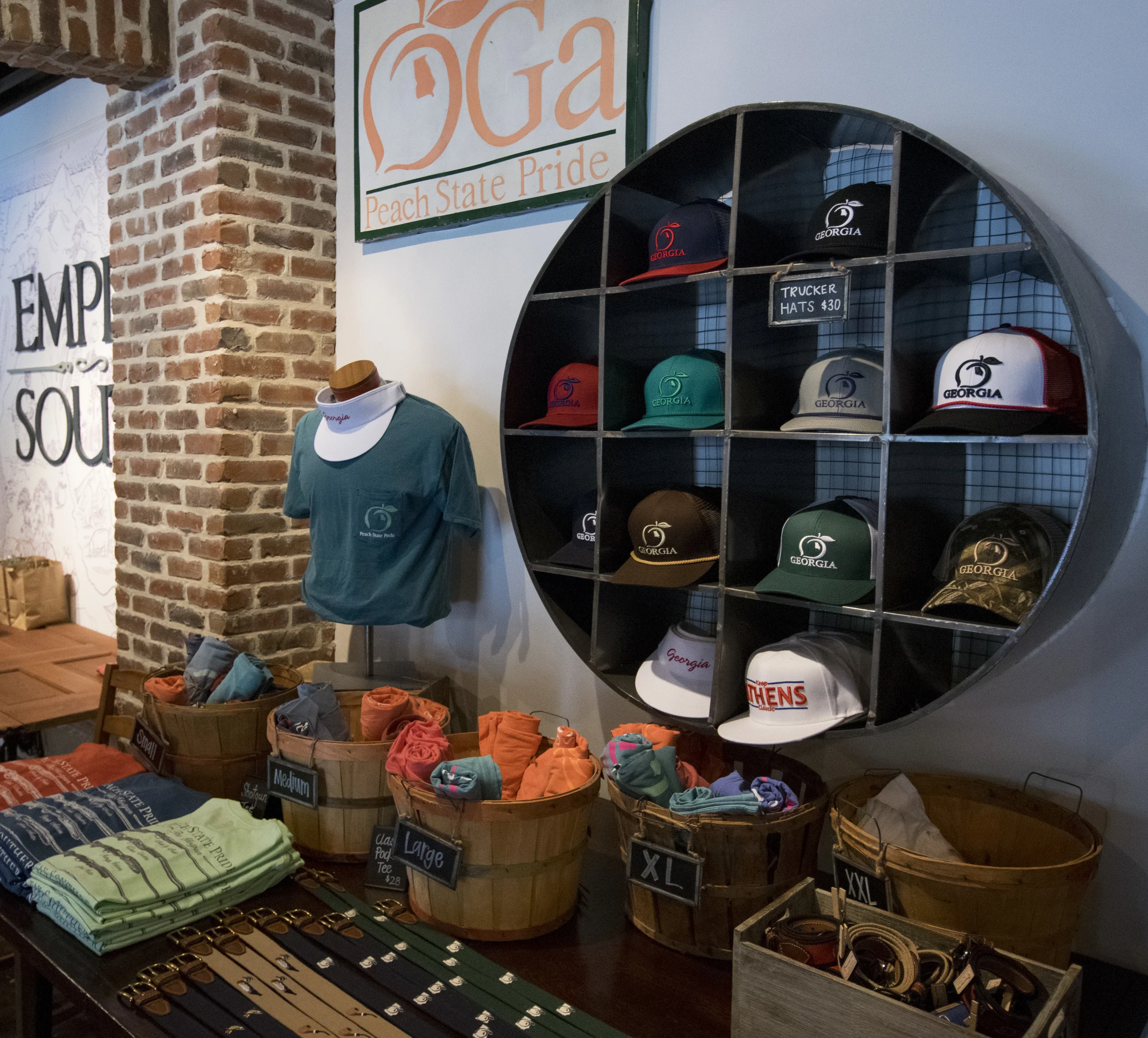
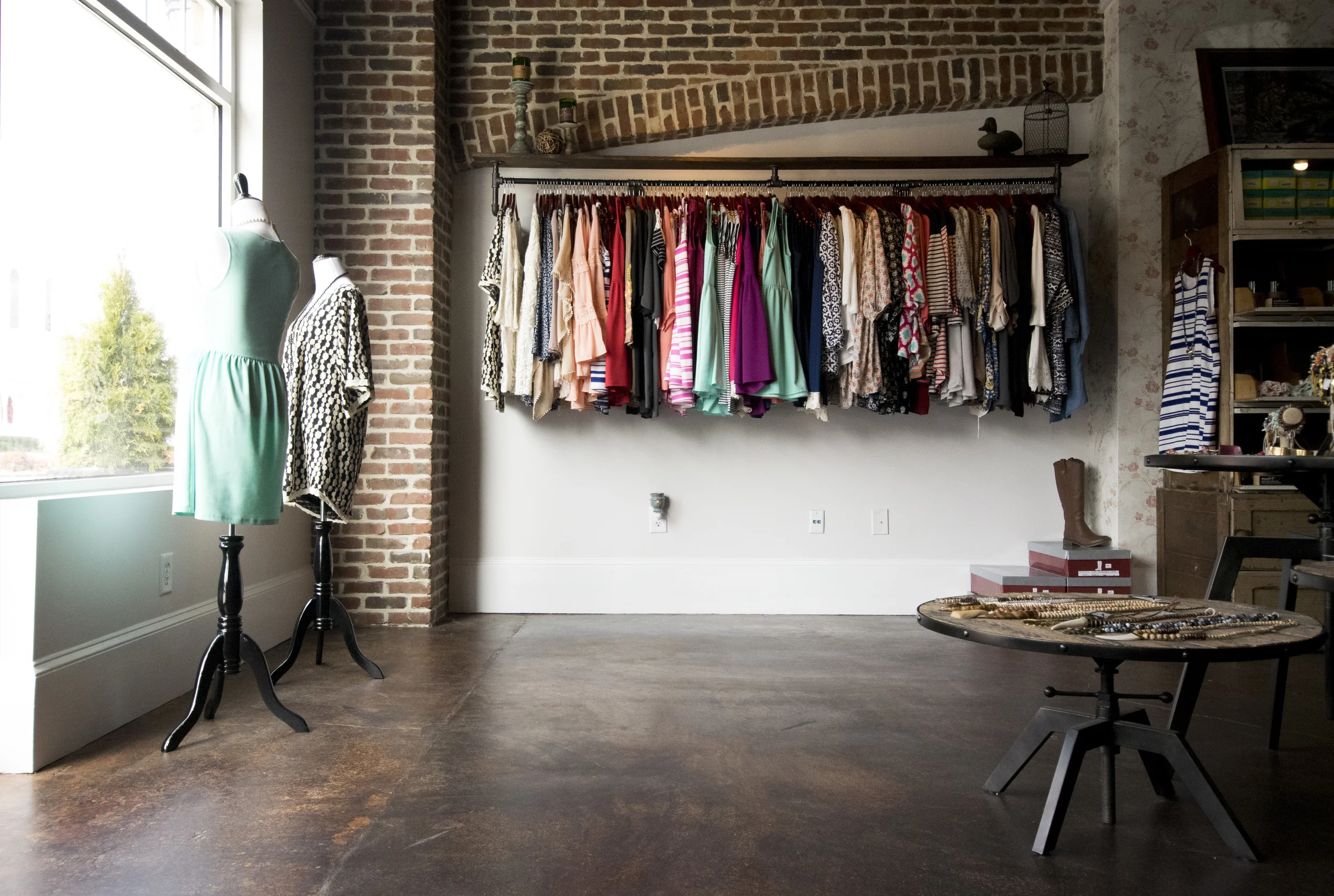
The details. Finding decor for this space was like being on a glorious treasure hunt. Many of the items in the store are family heirlooms of the owners, and others are memorabilia from across the state. We used these props sparingly throughout the space, but it does give you a sense that there is something to be discovered as you meander through the tables of merchandise. There are old paintings, antique maps, vintage signs...and a little bit of tarnish on the metal. Everything has a little history, a story behind it.
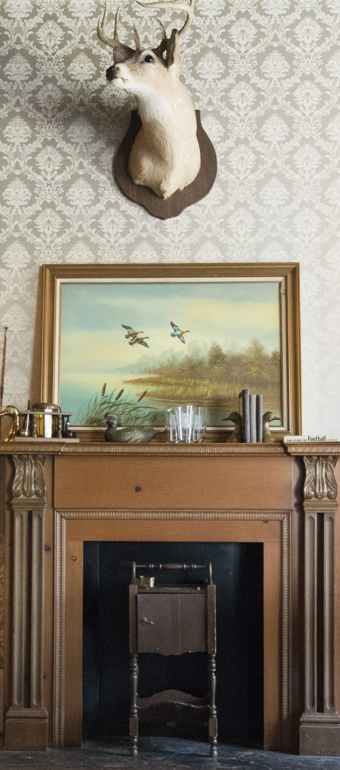
One of my favorite details in the space is actually the wallpaper. I don't use a lot of wallpaper (mostly because it's difficult to change later) but it was one of the ways that we could add pattern and texture to the walls and further that southern charm feeling. This one pattern in particular seemed just right for the mens side of the store. Refined. Subtle. And it went nicely with the deer above the mantle. It looks good on you, Mr. Deer!
All of the little trinkets and knick knacks were a simple way to help define the different sides of the store-- there's a women's section and a men's, and then the unisex items in the middle.
I think the shop does a really great job of offering something for everyone... even for the people not [yet] obsessed with the state of Georgia.
I feel like I'm seeing the Peach State Pride peach logo EVERYWHERE these days. Grateful to get to partner with this brand that is on the move!