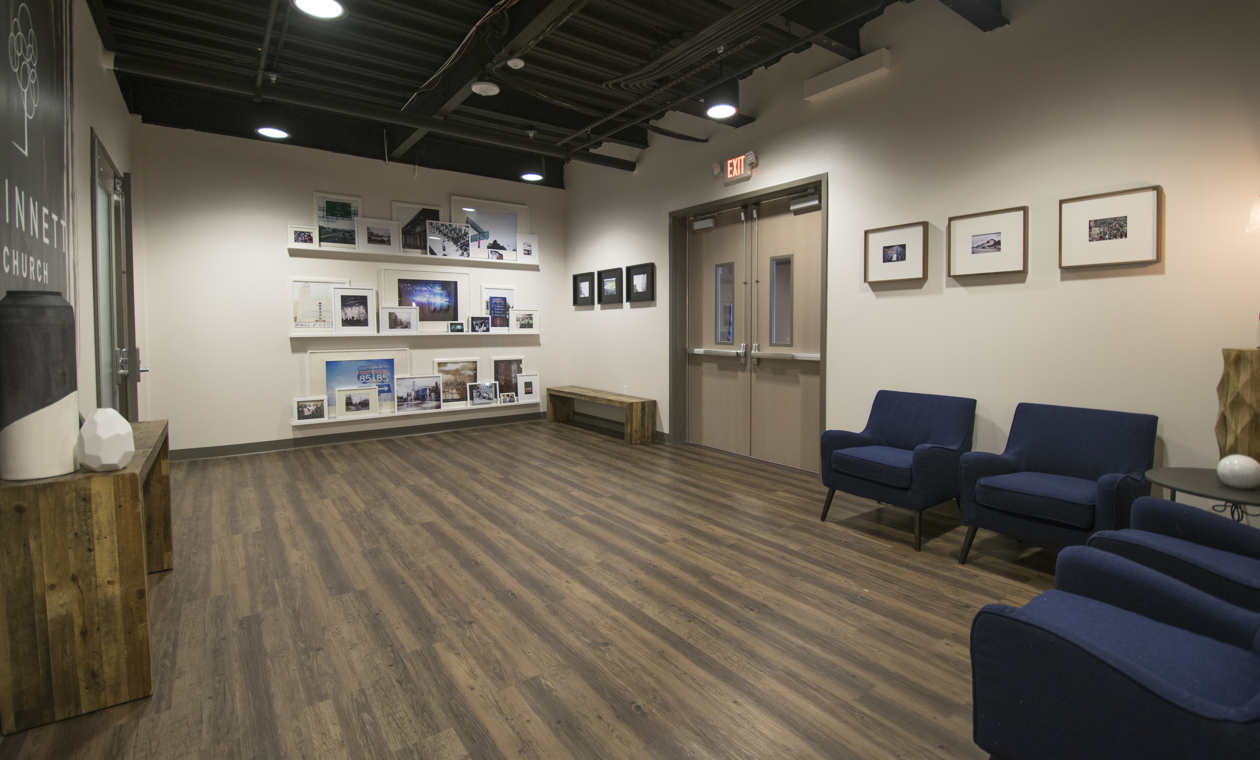
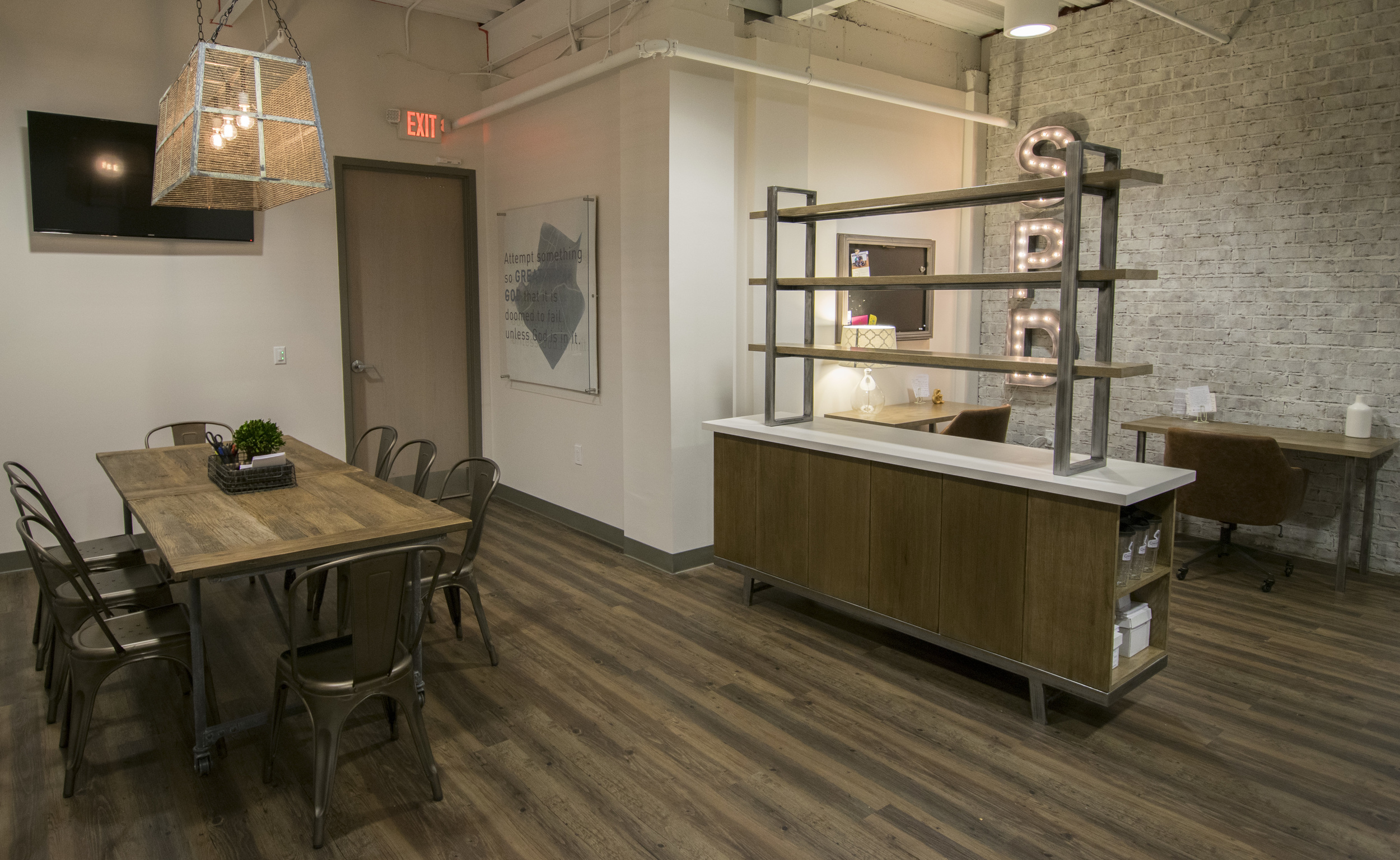
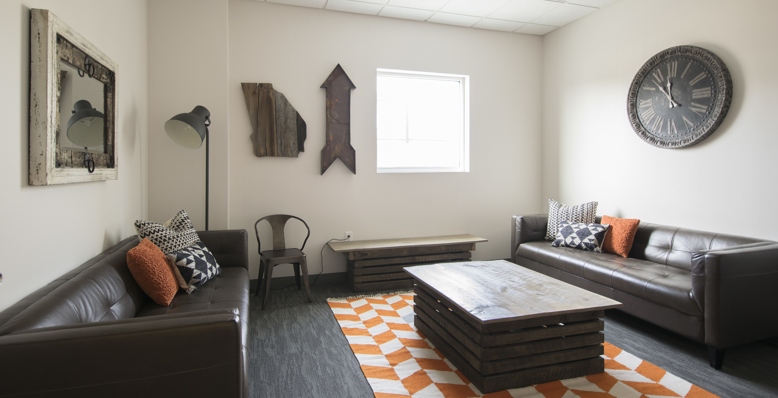
a reason to renovate

Are you thinking of embarking on a renovation or addition for your church? I’ve interacted with a lot of projects over the years — some with great focus, and others that seemed to struggle to find their way with creative direction. If you spend some time thinking about the goals of the project up front, it can actually help guide many of your construction decisions and even furniture purchases as you go. Having clear goals can help you know if your project is “successful” or not.

There are some very obvious reasons that someone may add on or renovate.

  • not enough space — there are more people than the current square footage can serve

  • adding a program that your building currently can’t support — ex: you want to add a gym because there’s no place for indoor recreation and you are adding a sports ministry

  • the current space does not reflect your organization — it looks like a doctor’s office from 1980 but you want church attenders to feel at home in 2023

  • there are safety or health concerns that need to be addressed — your building needs to get up to code, address broken tile, fix a hole in the floor, remove mold…

  • the leaders of your organization have prayed and feel like renovating is what they feel led to do

These can be awesome reasons to renovate.

There are also some very terrible reasons to add on or renovate that I’ve encountered over the years. These can cause great confusion during a project and really muddle financial decisions. You may want to reconsider the goals of your project if

  • the project is based on comparison to another church — do you think you have a “rival” that you have to “out-perform” ? Are you trying to look better than someone else in town? Other churches are your brothers in Christ. They are a unique part of the body of Christ. Run your own race. Pray and ask God what is best for YOUR group of people.

  • the project is based on vanity. Are you trying to show off how stylish YOU are? Are you making choices so that your colleagues will be impressed with YOU? It will be difficult to make the best decisions for your project if you filter them through the lens of what will make YOU the star. Take a step back and think about what is best for the project and what is best for the true goals of the space.

  • you think BRANDS matter. No one is checking under your furniture to read the tag. Make selections for your space based on what is best for the project. Don’t sink all of your money into a sofa because it’s from your “favorite store” but neglect the rest of the room.

  • you have a surplus of money and you “don’t know what to do with it.” If you don’t know what to do —- perhaps you should spend time figuring out the best use? :) A surplus of money is a great “problem” to have, but you must wisely consider the best use of your funds. If you don’t know “why” you are building a space, it will be difficult to make creative decisions along the way! Spend some time figuring out your goals.

  • you want to take advantage of a “deal.” Does your contractor have some extra tile from a job? Or did you see a bunch of sofas on sale? Is your friend getting rid of their pingpong table? I see a lot of spaces that look more like Goodwill than they do an intentional environment. Of course you want to be wise with your money! But don’t let the pressure of a “do it now” situation lead you to make purchases or choices that are not the right fit for your space. Don’t let a “good deal” be the initiator of your project. If you plan well, you create a focused concept and then execute on that. If you come across deals along the way, that’s great! But at least you’ll know if the items you are considering will work towards a cohesive, intentional space. Have the courage to walk away from the sale :)

It can be difficult to be honest with yourself and your organization about your motives, but it will be the best for your project if you can focus on the greater goals for the space. You are highly accountable to the people who give their time and money to your organization. Ask for wisdom every step of the way!

If you are starting out on a renovation or addition, here are a few great questions to ask

  • what is the purpose of the space? What do we hope will happen here?

  • who will use this space? How can we consider their needs?

  • how do we want people to feel in the space?

  • what are our resources? What is our budget? Who should be involved?

  • what is our timeline?

  • what codes, rules, and regulations do we need to consider?

  • when the space is complete, what components will make it successful?

  • have we seen any inspiration that we’d like to use? Are there good examples of similar spaces we consider successful?

Church Nursery Products - Infant Classroom

Thinking about giving the church nursery spaces an update? I’ve got a roundup of some products that you might want to consider for your littlest attenders! These are just a few examples of items that can help your space be more clean, safe, and fun.

Church Nursery Classroom - Infants

These items are great for an INFANT classroom

  • foam floor tiles I love using these as a soft play surface. They are so easy to keep clean and wipe down from any messes. Our little one went through a stage of putting EVERYTHING in her mouth when she was learning to crawl and it was nice to have a non-fuzzy surface for her to play on. I use these like an accent rug and put them in the middle of the room over any LVT or carpet that is there. They are easy to add on to also if you are looking to create larger foam pads or different sizes. There are a lot of options out there with great colors and patterns too — think of it as a cute accent rug for your room. These are much easier to maintain than laundering blankets and cleaning carpets.

  • foam changing pad (much easier to clean than a cloth covered one!) I will never go back to cloth covered changing pads. We have one of these at home too and I love it — really cuts down on laundry and again — so easy to spray down and clean.

  • swing There are so many great motion swings out there! You don’t have to get a big one to give that little baby a nice ride :) This one is nice and compact and has motion / noise features. I know there are a lot of Mamaroo fans out there too. I love that it’s on the more compact side and doesn’t have a huge base.

  • bouncer One of my favorite things about a bouncer is that they are easy to move around the room! Easy to pick up and bring the baby with you wherever you are playing

  • sit up assist seat I would actually recommend this INSTEAD of a more rigid foam sit up seat. The fabric on this is much more flexible for different anatomy / body types. For some reason my girls never liked the more rigid foam seats and using a fabric sit up assist seat was much better suited to their body/ability as they began to learn to sit up.

  • exersaucer/ activity center Once the little one has more stability, they’ll love a spot to sit supported and have lots to touch and play. It’s great to have a variety of places to care for and play with the babies. Their abilities change so quickly, so it’s great to have options for every stage!

  • crib When considering cribs, please consider your local guidelines as well as if your facility is considered a “daycare” during the week. You’ll want to adhere to the highest level of safety and emergency preparedness. If your facility needs evacuation cribs, they will be ON WHEELS and able to be moved easily in case of an emergency (and fit through the door frame:) Also — please be aware of age appropriate safety guidelines. Although many companies do styled photoshoots with pillows and blankets paired with cribs, it is NOT safe for a young infant to sleep with pillows and blankets due to suffocation hazards.

  • sound machine Got little ones trying to nap? A sound machine is a must to help cut through the extra noise in the classroom. This one is easy to use and can be controlled from your phone. The different color light options are fun for little ones too :) Looking for a low-tech version? This sound machine is a perfect fit!

  • toy storage Try to find toy storage that is easy for volunteers to manage. Visually accessible. Easy to keep clean. Has some air flow. Avoid deep baskets where the toys at the bottom never get used. A few simple toys that are organized well are better than a million pieces of toys that people have to pick up every time play time is over. The Ikea Kallax series is also a great resource for larger configurations of cubbies.

  • rocking chair You’ll want a rocking chair for all of the snuggle time —but you’ll want one that is easy to keep clean even more! I highly recommend one that has a vinyl upholstery on it. Most rockers have traditionally been cloth but you’ll be just as comfortable with a faux leather and it will be so much easier to wipe down when there are spills from the bottle. And there will be spills :) I actually prefer a ROCKER over a glider. I like that the base is open with no sliding mechanism (don’t want little fingers to get caught) and there’s no ruffles or panels to hide crumbs or little toys. Looking for a more commercial grade option? I love the OFS Mention with the rocker base. This chair is more of an investment, but comes with hospital grade upholstery options and warranties on the frame. Reach out if you’d like a quote!

  • are your volunteers feeding babies? Arm them with some cute burp cloths

  • sturdy coat hooks Diaper bags can be heavy! And if you have several hanging up, you’ll want a nice strong row of hooks to support those bags. Make sure to appropriately anchor them to your wall!

  • consider adding child safety locks to all of your lower cabinets if there is a chance of babies crawling around in the room. I’d recommend using the screws to anchor the locks.

Typically, churches create a different space for kids as they begin to crawl. Check back in for more recommendations for those little guys!

All of the items linked above are either purchases that I have made recently and recommend or ones recommended by my clients. The Amazon links above are considered “paid links”. As an Amazon associate, I earn from qualifying purchases but each of these is a sincere recommendation that I think will help you have a great space!

empire south // peach state pride

We really enjoyed the opportunity to team up with the Peach State Pride brand to expand and re-envision the their space in downtown Watkinsville, GA.  Retail units can feel kinda blah with "builder beige" paint and acoustical ceiling tiles, so we set out to create a store that spoke more to the identity of their brand.  

After spending some time with the Peach State Pride team and learning about their company, I quickly saw that this was a company truly built on pride (or more like overflowing-esteem-and-pure-LOVE) for the state of Georgia.  This was not obnoxious fandom. This was a respect and admiration for a place that has a rich history and celebrated culture. I was kind of amazed at their love for Georgia history and impressed with their knowledge of the state's businesses, economy, and even interest in small towns that scatter across the land. It is always refreshing to find someone with true passion! Ok-- so now you get it--they love the peach state. From there, we discussed the feeling that they wanted the store to embody. Some features that were important: rich history, southern charm, and a casual, yet refined, atmosphere.

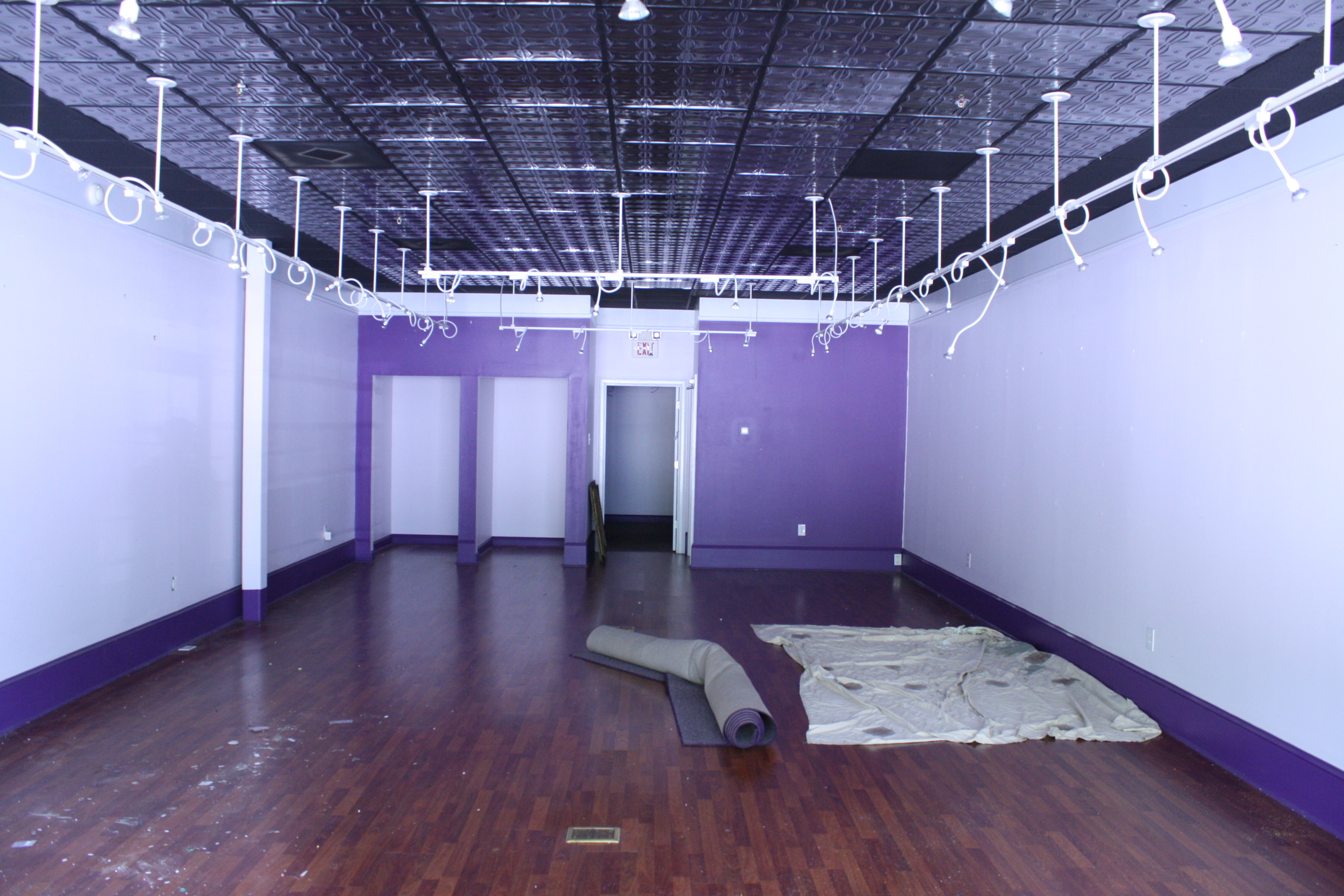
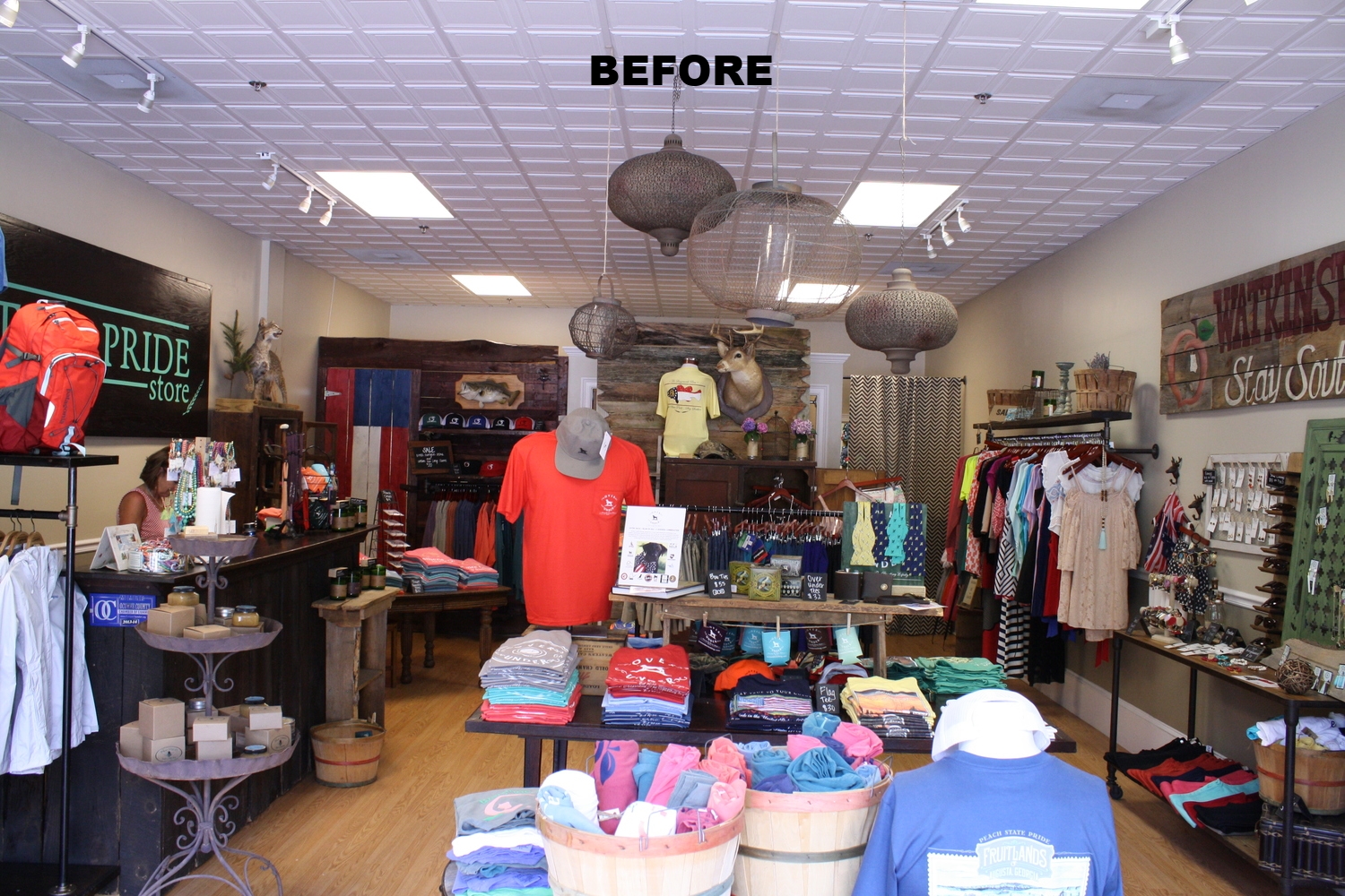
The shop already occupied a retail space, and they were looking to expand into the unit next to them as well. It was exciting to get to double the size of the store, but making a seamless transition between the two units meant both needed to just start from scratch. The two spaces looked a little different as you can see below...

TWO ORIGINAL UNITS:

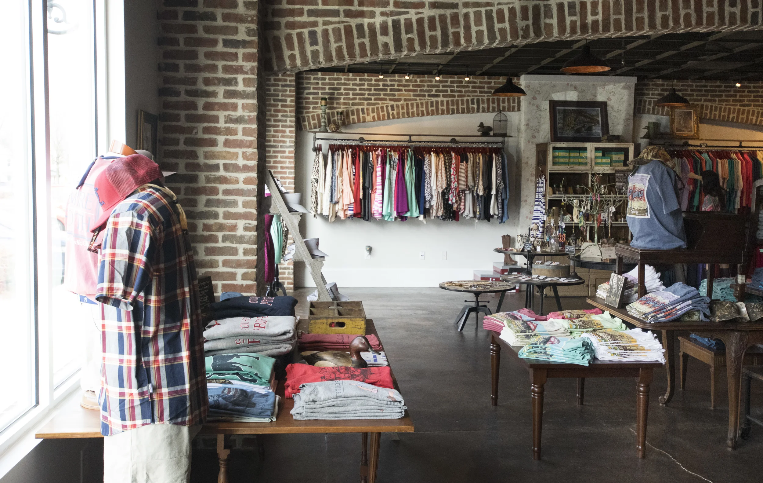
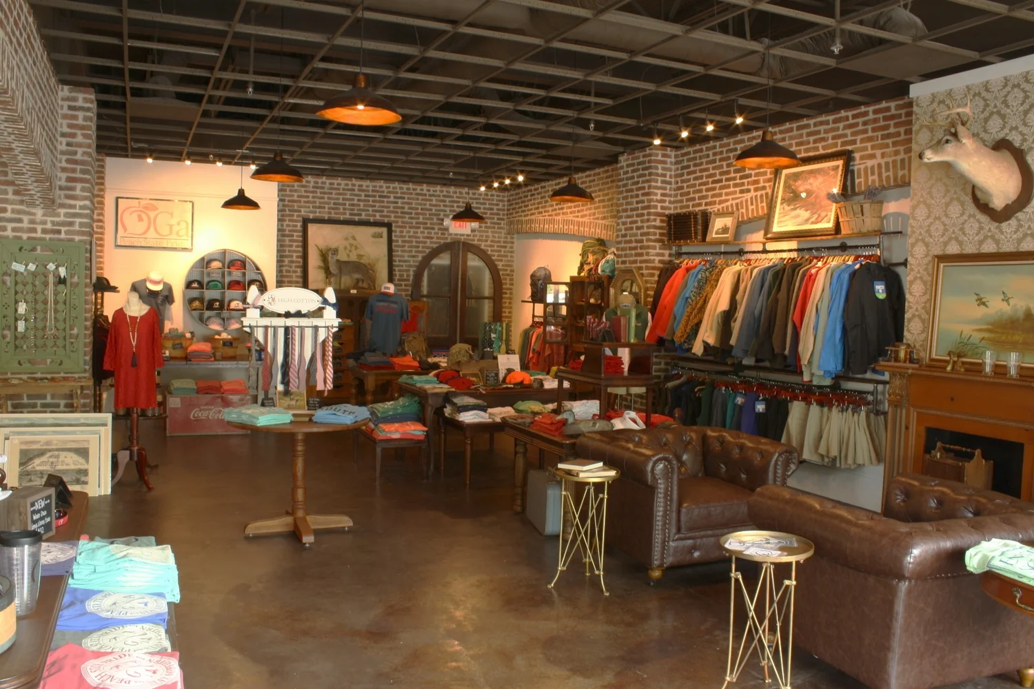
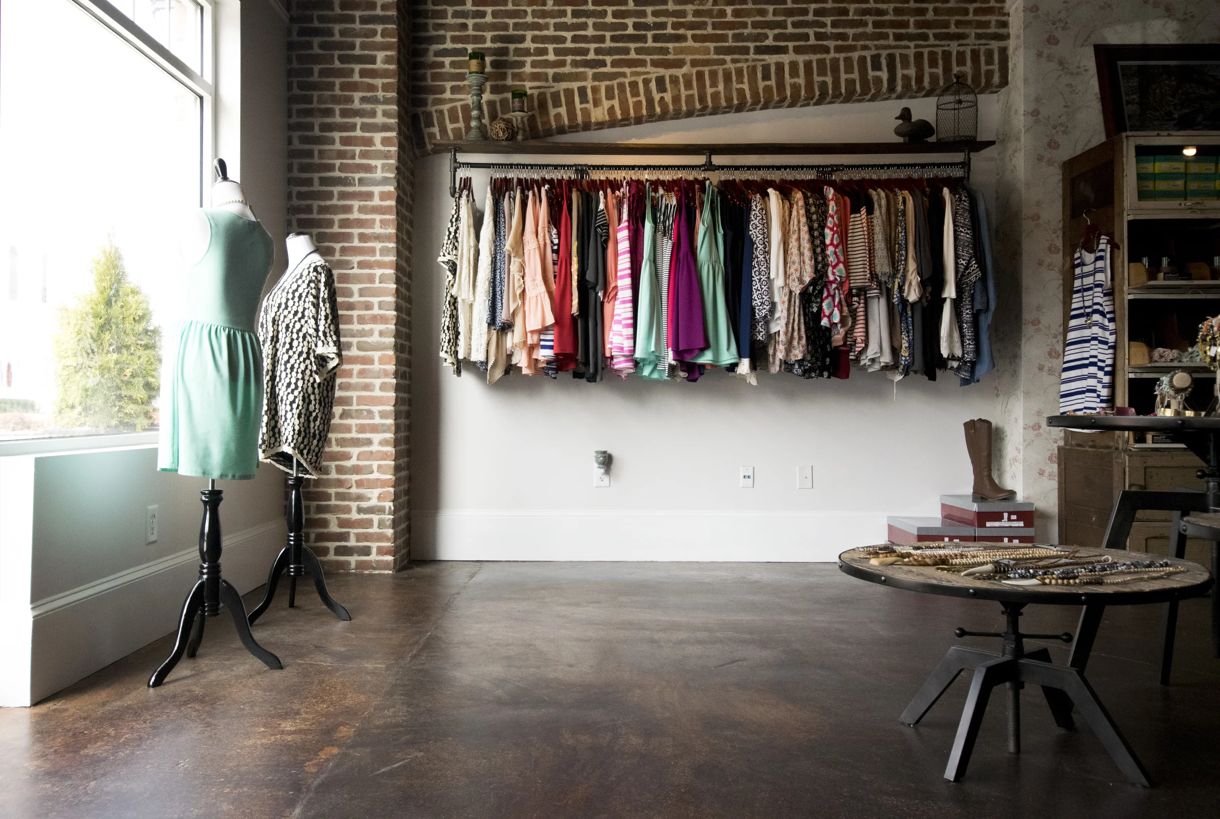
Brick. It became a "must have" for this project.  The brick gave a rich texture and color and really added to the old southern charm of the space.  We used it to create columns and arches that gave the space a rhythm and connected the two combined units.   We know we aren't fooling anybody-- this building was not built in the 1820's-- but the brick really did make the space feel older, more substantial, and more established.

The ceiling and floor provided other opportunities to unify the two spaces.  We removed all of the ceiling tiles and painted the exposed structure above. For the floor, we removed the mismatched laminates and chose a rich, brown stain for the concrete.

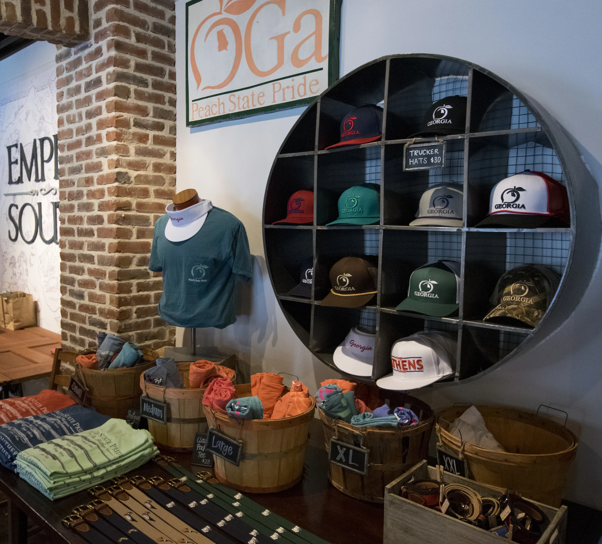
The details. Finding decor for this space was like being on a glorious treasure hunt.  Many of the items in the store are family heirlooms of the owners, and others are memorabilia from across the state. We used these props sparingly throughout the space, but it does give you a sense that there is something to be discovered as you meander through the tables of merchandise.  There are old paintings, antique maps, vintage signs...and a little bit of tarnish on the metal.  Everything has a little history, a story behind it.  

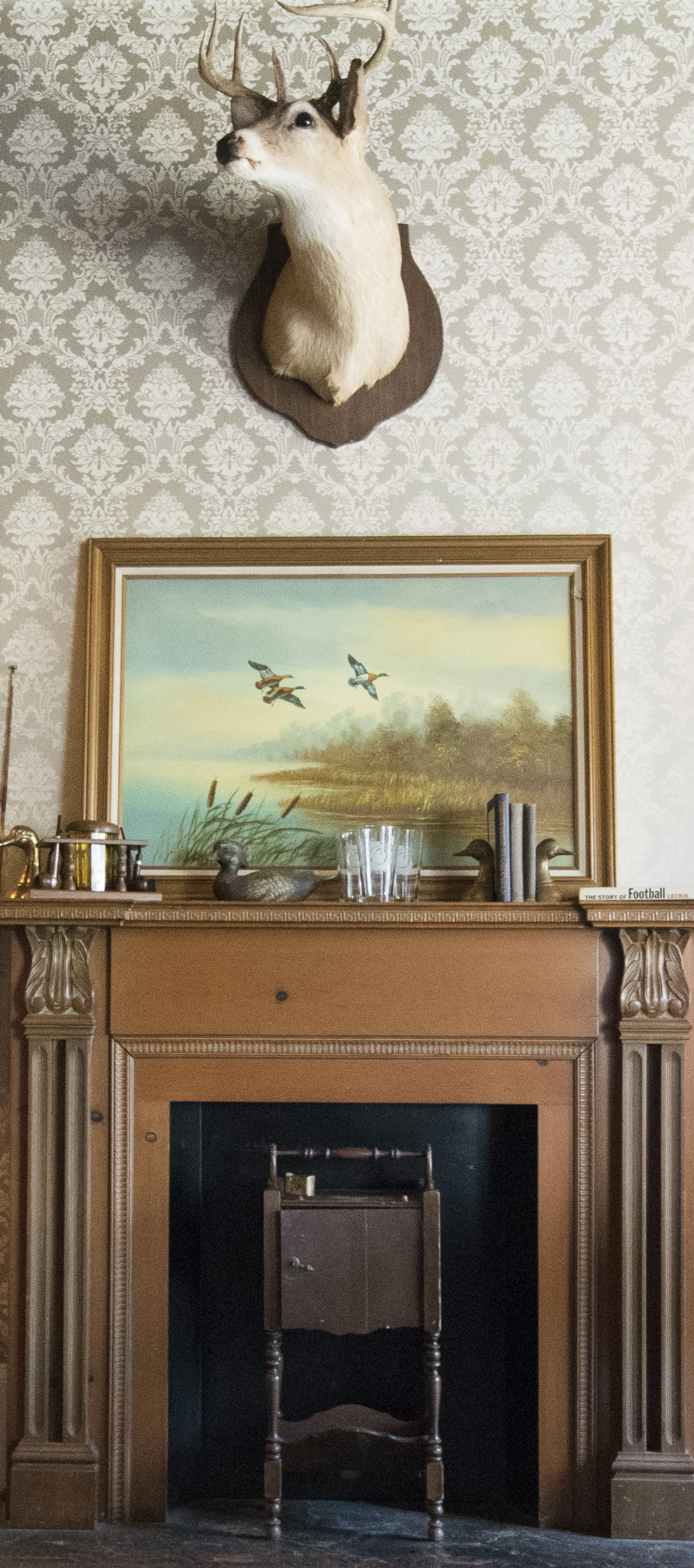
One of my favorite details in the space is actually the wallpaper.  I don't use a lot of wallpaper (mostly because it's difficult to change later) but it was one of the ways that we could add pattern and texture to the walls and further that southern charm feeling.  This one pattern in particular seemed just right for the mens side of the store. Refined. Subtle. And it went nicely with the deer above the mantle.  It looks good on you, Mr. Deer! 

All of the little trinkets and knick knacks were a simple way to help define the different sides of the store-- there's a women's section and a men's, and then the unisex items in the middle.  

I think the shop does a really great job of offering something for everyone... even for the people not [yet] obsessed with the state of Georgia.  

I feel like I'm seeing the Peach State Pride peach logo EVERYWHERE these days.  Grateful to get to partner with this brand that is on the move!


Gwinnett Church

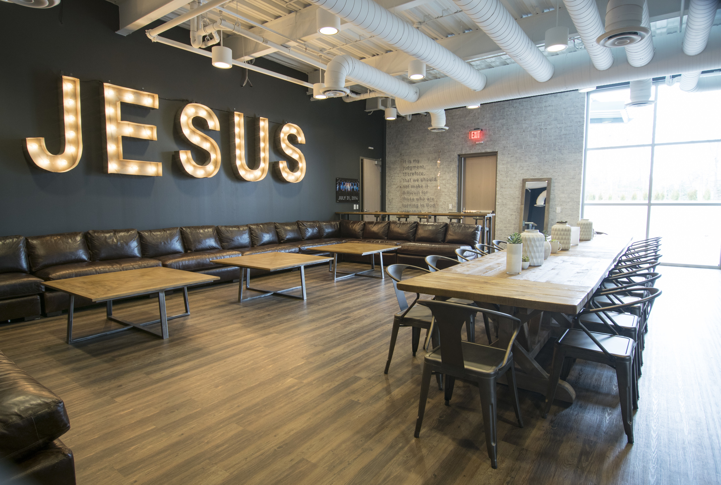
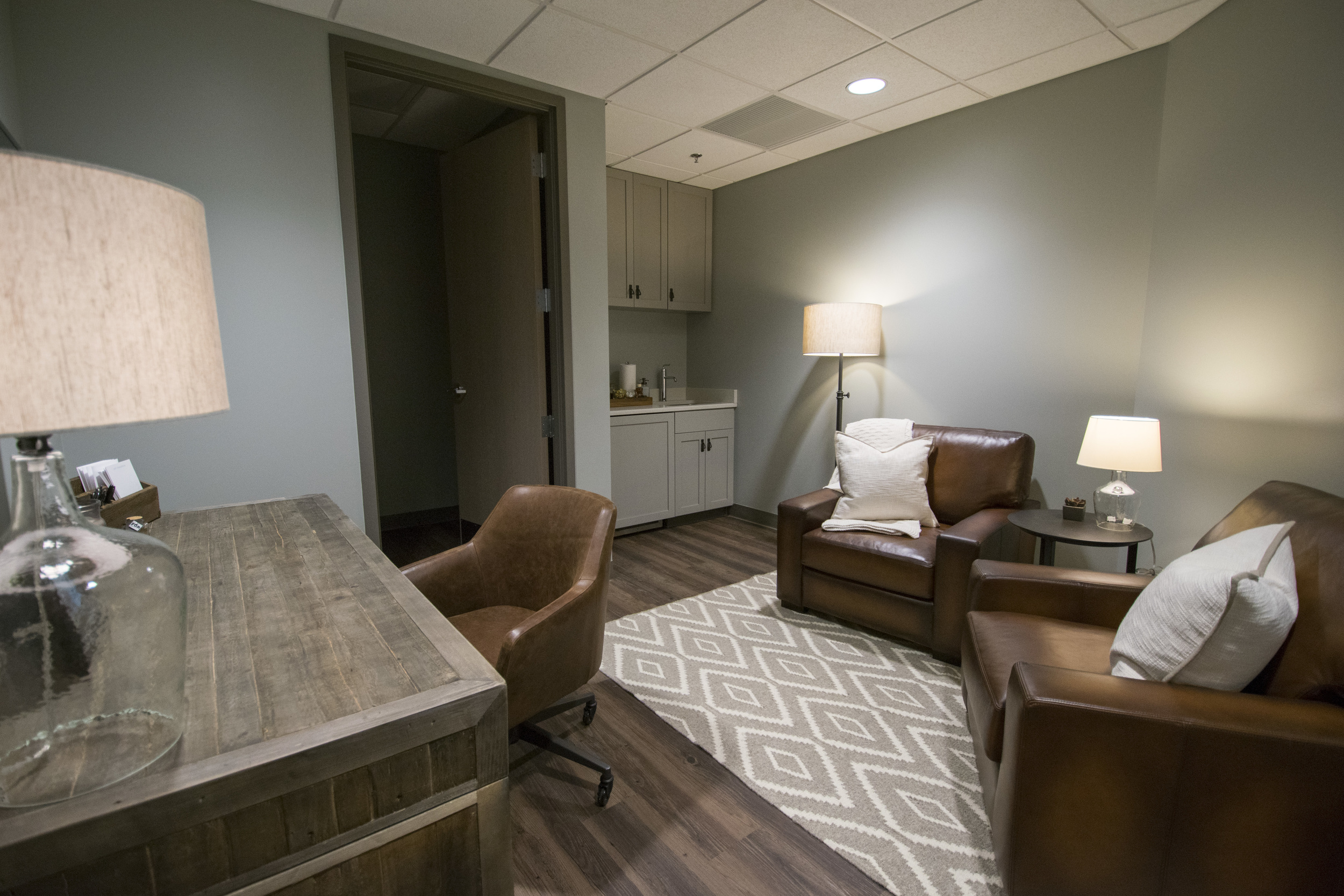
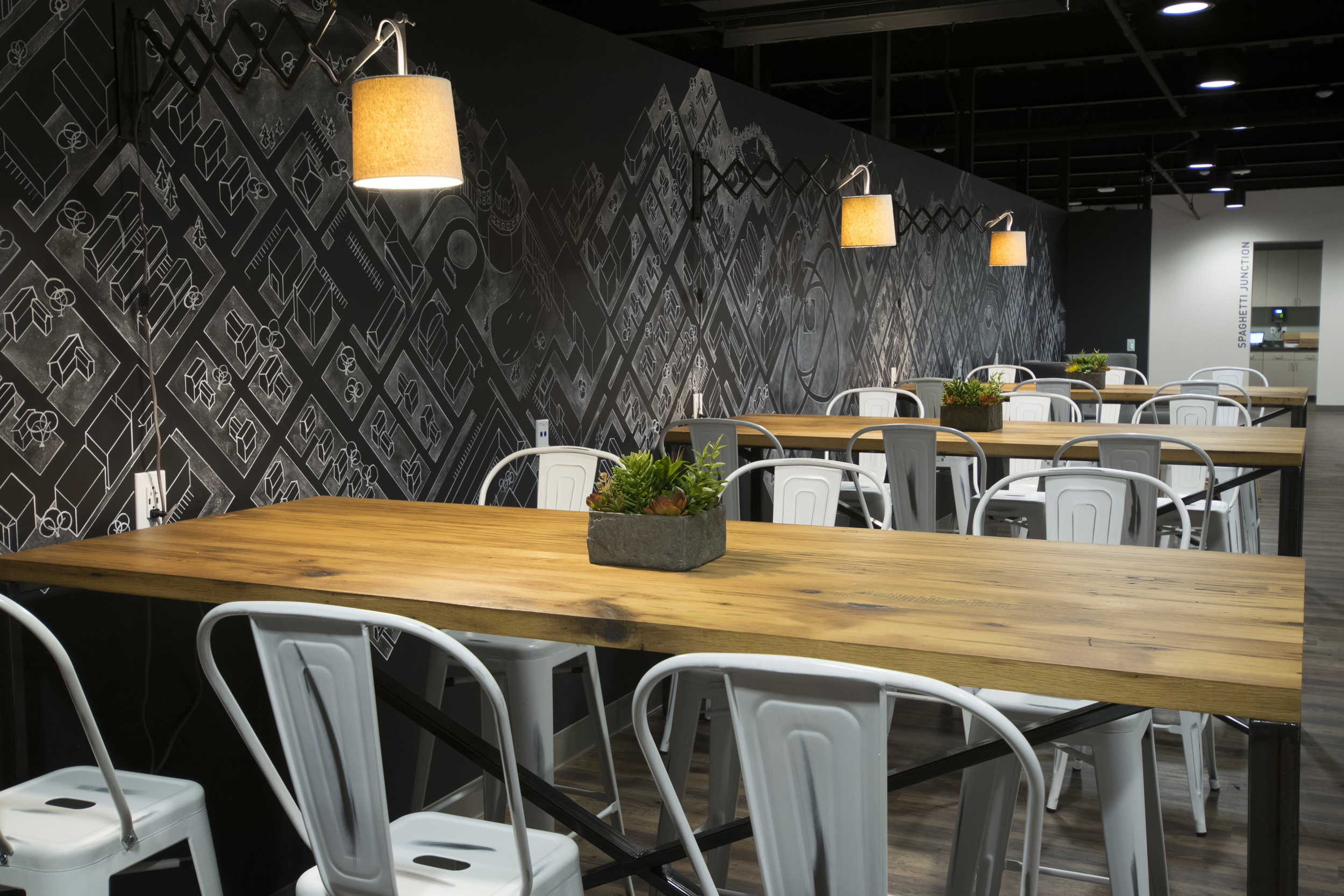
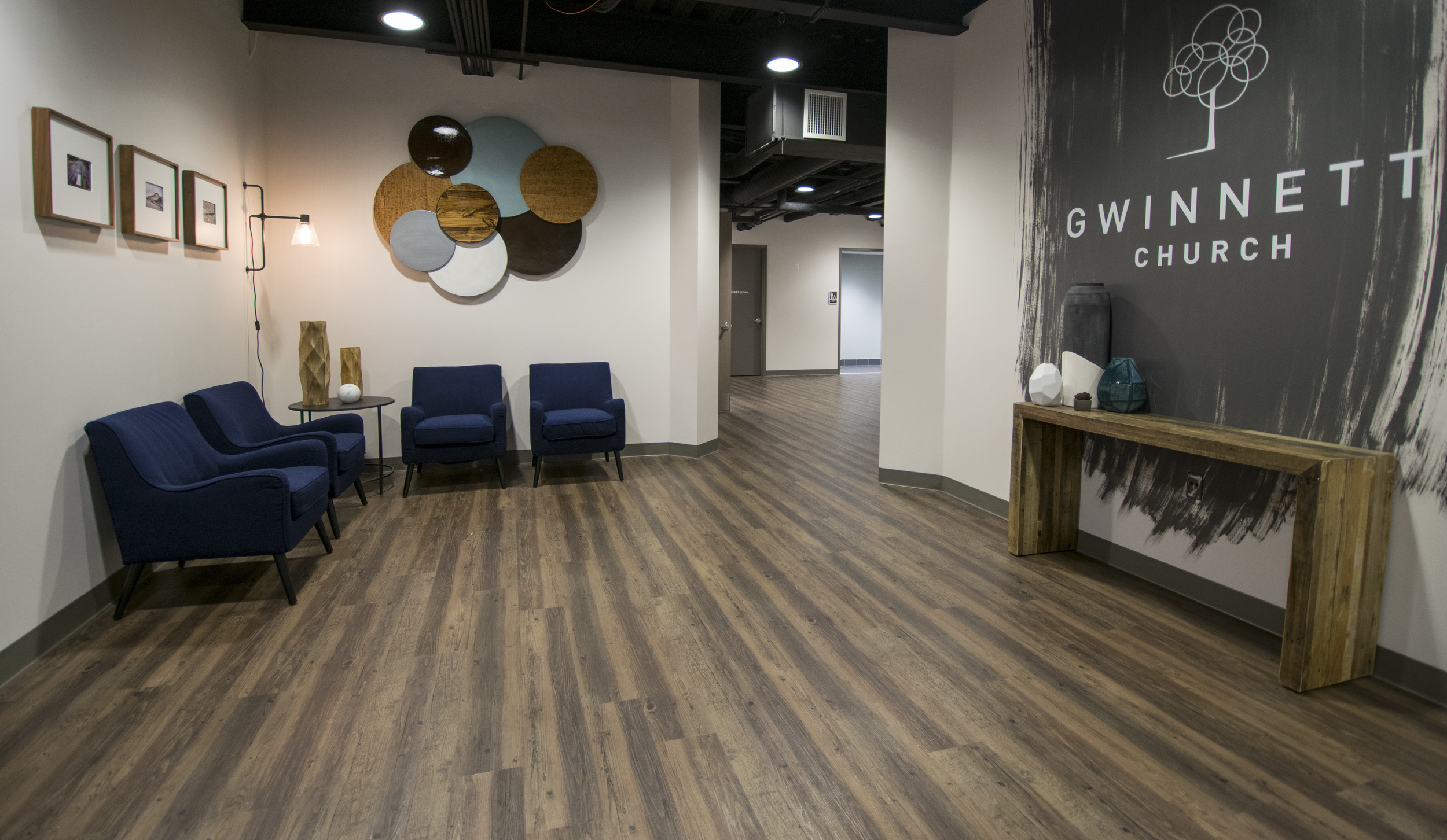
Guys. Talk about a MASSIVE project.  Gwinnett County has been one of the fastest growing areas in the country for years, and Gwinnett Church building really reflects that explosive growth.  This building was years in the making and it's just the beginning of what they plan for this community.  Taking a project from a pile of dirt to a finished space is definitely the most challenging endeavor....using floor plans to envision spaces instead of real walls and floors just waiting to be designed (disclaimer: I am not an architect or a contractor...they helped too :).  But perhaps more exciting than just "decorating" these spaces was walking through the process of finding the creative voice to display the heart of the staff and the heart of the church for the community of Gwinnett.  They provided so many unique, individualized touches to these environments that make them so much more personal.  Also, with new construction projects...things change (duh?). Budgets get reallocated and floor plans change....and therefore designs change.  I could go on forever, but this project was really a labor of love for dozens, if not hundreds of people....and you can tell by the way it looks :) I hope you enjoy looking at some of the highlights.

The Atrium

The thing that originally drew me to the field of interior design is actually logistics. I really love creative problem solving and working on spaces that not only need to have decor but also need to function. For this project with BRR Architects we got to explore defining this high-traffic space with flooring patterns and furnishings.  

This atrium is an addition to the front facade of North Point Community Church.  The church needed a larger common area at their entry-- a very accessible space, but out of the traffic of the main hallways.  The architects crafted the Atrium to be a beautiful meeting place.  The window wall is really stunning, and although very spacious, it feels like a bit of a haven from the flow of people in the halls.  The church has thousands of attenders every Sunday, and the Atrium location provides the perfect anchor to the building-- a clear spot to meet up with a friend or get your questions answered at one of the Guest Services desks.

We created custom designed info booths for their Guest Services team to greet you at either end of the space.  Each one is made of four pieces that form a circular information booth that can be approached on all sides. They also have the ability to position the pieces with some space between, making it easy for a volunteer to step out from behind the booth to assist a guest.  Both the info booths and all of the lounge furniture are modular and portable, providing a lot of flexibility.  This was very important for the staff as they use the Atrium for a myriad of events outside of their typical Sunday services.

We utilized  flooring changes in the space to define different zones and add texture and pattern.  The entrances have an LVT product with a steel look, helping further the subtle industrial elements from the architecture.  An elm look LVT is used as a transition to the main carpeted path as well as a border to the seating area where we used a silver linen look LVT.  All of these flooring materials also help bring out the colors found in the stone used  throughout the space.

The wood added to the headers and walls really helps complete the Atrium. It adds warmth and variety to the neutral gray palette, and helps draw your eye up to the height of the space.

Furniture completes the space with timeless pieces that are easily moved and reconfigured for Sundays and events.