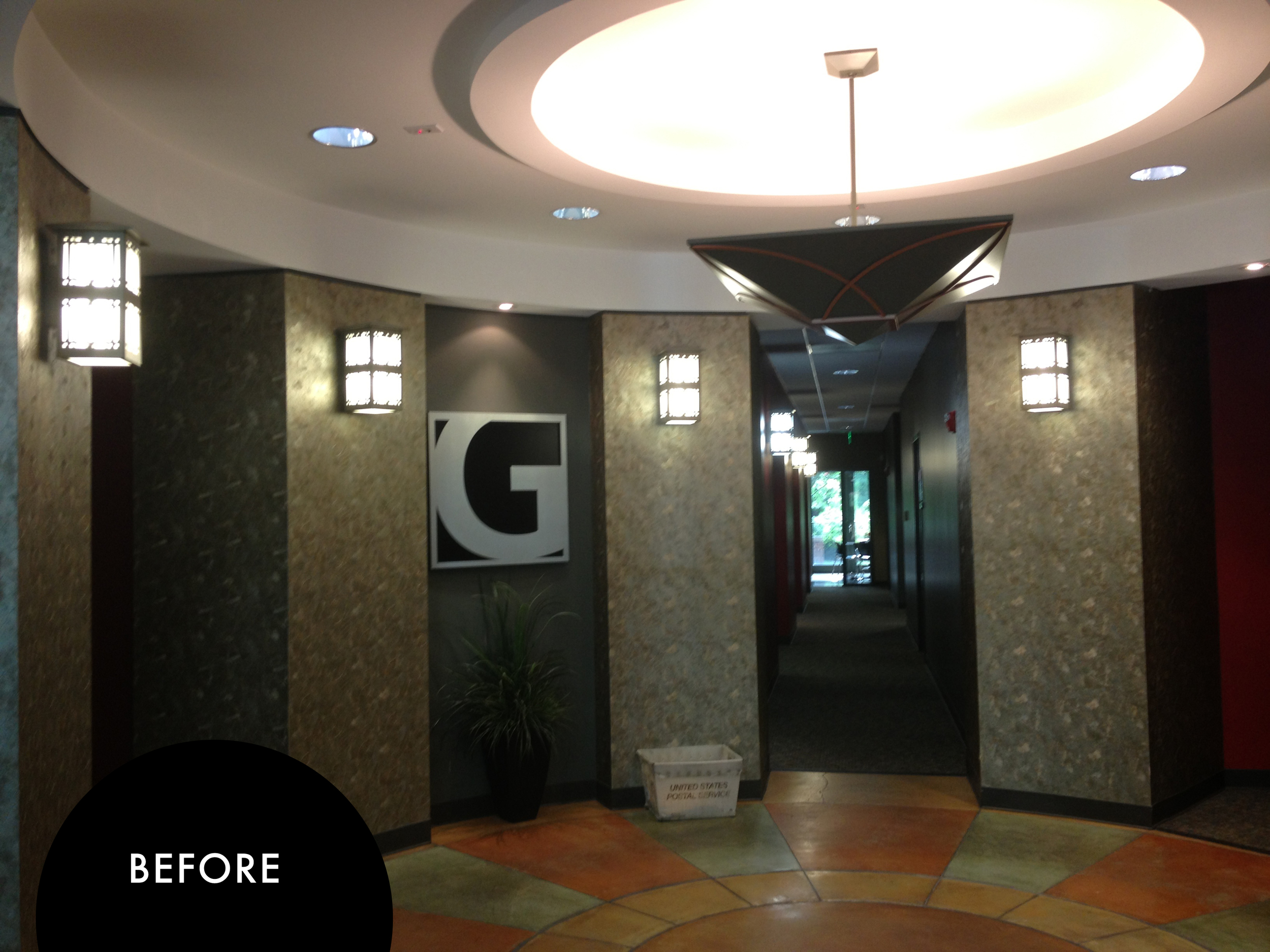
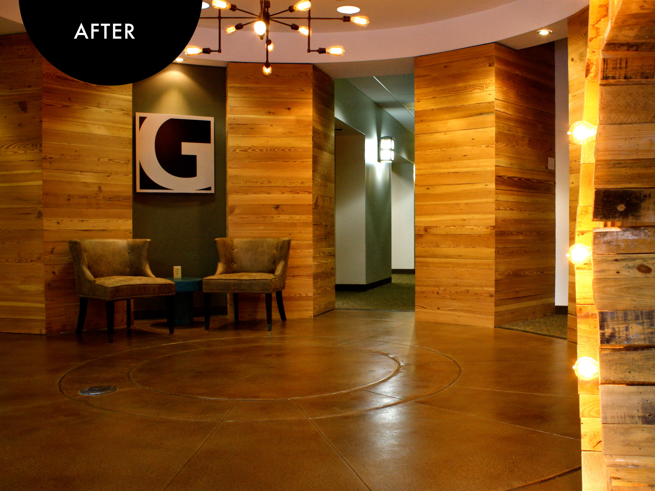
athens church warehouse

We had a lot of fun working on this side project with Athens Church. Here's to a client that lets me color outside the lines! And even sometimes make some new ones...

The really fun wood creation from our friend [and wood genius] Lane Seabolt

I like to find inspiration everywhere.  Somehow this little iPhone case spoke to me as being a great vibe for the Warehouse.  The lines, the colors, the wood-- it all felt just right.

IMG_5466.PNG

And a few pictures of the finished Warehouse space

giant impact lobby

GiANT Impact is a hip company.  Their lobby, on the other hand, was not.  It's tough to work on your own spaces with your company moving at the speed of light, but the GiANT Impact team knew that it just didn't fit to have an outdated space for their cutting edge staff.  We got to transform the lobby with a few simple updates that made the entry feel more appropriate for their forward-thinking team.

Working in rented or leased spaces can pose some challenges-- especially with getting changes ok'd by the landlord.  Swapping out a light fixture usually isn't an issue, but sometimes making changes to wall treatments can be.  The old lobby had columns covered in a metallic textured wall paper…a beautiful detail back in the day, but now dating the space.  Had. To. Go.  Rather than pay for the labor to get it removed and the walls refinished, we created wood plank column wraps that added warmth and texture, but actually left the wallpaper intact underneath.

The sconces got removed all-together. They weren't necessary for lighting the space and seemed to be a little overwhelming for the small area.

Another needed update was the floor…err…the dart board? the compass? sundial? The green and yellow stain work drew a lot of attention to itself.  We had the floor resurfaced and restained a rich brown.  Getting stained concrete the right color can be a challenge-- it's a variable process with a pretty unpredictable outcome-- I like to tell the installer "make it look like you poured Coke on the floor." I think he did a good job :)

The team needed a spot for mail coming in and out, so we used a credenza at the entry and added art that the team had from a recent event.

 A few simple fixes for the team's new entry space!


ardoin home

**I need to start this post with a huge THANK YOU to Kelly! She is a really talented photographer and shot the photos of her place. How great is that, folks?! She's amazing.**

What an honor it is, for some one, a stranger, to invite you into their home and trust you with the vision that they have for their space. We started out as strangers but have become great friends!  Kelly and I got connected by a friend (thanks, Erin!!) and got together for an initial consult. When we met, she was frustrated by the layout of the living room and just ready for a change. She already had some great ideas and I was able to help her bring them to life!

In the living room we wanted to address a few key items:

  • LIGHTING -  the overhead lighting was dim…except for the piercing sunbeam that was coming through the window high up on the wall.  Solution? We added recessed lighting in the ceiling and a remote controlled shade for the window.
  • LAYOUT - the space was tricky for group conversations and not utilizing the space well. Kelly and Scott are great entertainers and needed this area to feel more enclosed.  Solution? Kelly already had a great sectional sofa picked out. We added chairs closer to the fireplace and centered the seating area closer to the television, not the fireplace.
  • SCALE - there were some great opportunities to add items of larger scale to highlight the  tall ceilings. Solution? We added a really lovely painting from local artist Andrea Costa and added a custom built entertainment unit on top of the existing cabinets. It filled up the wall space and gave them an opportunity to put up more family photos and mementos.

The next area that we tackled was the kitchen.  No updates needed to layout or appliances, we just wanted to make the space feel lighter and fresher.  The cabinets were a dark green, so we updated them to an off-white with a contrasting black island and hood cover. 

One of the opportunities to add the most personality to the space was Kelly's office.  Most people's home office can turn into the catch-all space for kids/work/and the-randomness-of-life-that-didn't-find-another-place-in-the-house so we wanted to make sure that this room was multi-purpose but without looking like it had an identity crisis :) Kelly has classic taste with a modern flair so this was an opportunity to pull in some fun color.  

Personally, I think that owl is a masterpiece!

By changing up the layout, we created a spot for Kelly to work, utilizing the bay window and natural light. She had a really beautiful antique desk that we got restored--it fit perfectly in the nook.  The left side of the room is all for the kids-- a space to do their homework/projects and display their art on the magnetic pin board. Adding a small loveseat gave a perfect spot for the parents and kids to read together or just hang out while someone is working. Yeah- that's a hot pink rug that you see in there--- I told you we added personality in here :)

The dining room was an opportunity to utilize several of their existing pieces and update them to give them new life. We kept their dining table, buffet, and some accessories (if it ain't broke, don't fix it!) but added the other accents in the room.

Sometimes you need to get a custom piece made to fit a unique space… and then sometimes Crate & Barrel makes the most perfect dimensions for a cabinet and you jump up and down clapping your hands in excitement.  There's a very unique inset nook in the back corner of the dining area that seemed like it would require a custom storage solution, but I was really thrilled to find a piece that fit perfectly!  From there, the space just needed updated chairs and accessories and it took on new life.


Ahhhhh… and here we arrive at the master bedroom. A peaceful oasis of soft neutrals and soothing turquoises.  We wanted this space to feel peaceful, refined, and welcoming.  Again we utilized the window space, this time with a custom chaise. Other updates were painting to highlight the architectural features of the ceiling and updating the accessories.  One of my favorite details are the lights that we added over each night stand (another one of Kelly's brilliant ideas!) This freed up space on the night stand, but also added height and balance by bringing attention to the symmetry around the bed.

summer projects

This summer is full of big/long/amazing/wonderful/exciting projects. So much growth. So many new beginnings. The opportunity to work alongside clients-- to dream together-- to create spaces that communicate a purpose, a mission---- I don't take any of it for granted! I am honored/thrilled/heart-super-full to get to have a small part in what some local Atlanta churches have in the works. Check out the plans for North Point Community Church's expansion and Gwinnett Church's new construction at http://npcometogether.com.

Stay tuned. Can't wait to show you the progress on these spaces as they come to life!

project progress // cornerstone church

Cornerstone is nearing the finish line! Sharing a few sneak peeks as the spaces begin to take shape. It's only a few more weeks until the building is complete. Excited for this east Athens, GA church!

The main hallway viewing the entrances to the worship center.

Laura Gross, our fabulous muralist, doing what she does best.

Ok-- I know this pic is blurry (camera not cooperating), but you've got to see the lights that they put in the elementary kids area. This place looks like the night sky. It is so cool!!

The worship center stage coming along nicely. There will be stacked ledge stone on the face of it soon.

Not so stately now, but the pastor's office will look great soon!

curtis home

Recently, I had the joy of working with a friend to update her home in Athens.  Laurie wanted to move away from the rich, dark colors that filled the home and create a light, airy, fresh feeling throughout all of the spaces. Doesn't every family need a home that reflects them? The Curtis's are a fun bunch-- a husband and wife, two girls, a new puppy, and lots of dreams on the horizon --- and they needed a little refreshment in the house.

All projects are unique, but Laurie and Matt had a special request: incorporate several family heirloom pieces throughout the home-- they had recently inherited several antique pieces and wanted to use as many as possible. Luckily, the furniture not only fit in with the style that Laurie was going for, but they actually fit great in the spaces where we needed them (wiping sweat from brow here… lots of measuring involved…I was a little worried at first! but each piece ended up being the star of the room!)

One of the pieces was this armoire. We had it cleaned and the doors refitted to slide into recessed pockets (so that it wouldn't block your path to the stairs or the armchair when open.) One of the interior shelves that was moved in the process was so unique and beautiful that we even decided to mount it to the wall on the right of the armoire.  Not quite sure of its original intended use, but the pegs and hardware on the piece really looked lovely and added rustic charm that complemented our updated style.

Family Room.jpeg

This was the living room BEFORE. Love how adding the armoire maximized the height of the room!


Another goal that Laurie had was to reuse her red armchair from the living room.  We really couldn't work with the existing red floral print on it, so we had it recovered. A lot of times recovering a piece is just as expensive as going out and buying something new, but when your chair has a lot of sentimental value like this one, it's totally worth it!  Here's that chair looking as good as new…

IMG_2414.JPG

The family also needed an office space. They had the room for it, it was just occupied as a playroom… a very organized playroom :) 

Office : Before

Office : Before

With the girls getting older, they were able to find other spaces throughout the home that they could keep fun stuff and dedicate this space for Matt and Laurie to have a room of productivity and organization… and really show off the sweet art from Tara Lowry's etsy shop with all the area codes from places they've lived.

I'd love to have known LA Laurie ;) …

Office : AFTER

Office : AFTER

Speaking of the girls getting older-- here's a before shot of Paige's room. Super fun pink, but she was tired of it and wanted a more grown up/fun teen room.  

Paige's Room : BEFORE

Paige's Room : BEFORE

I had Paige make a wish list of things that were important in her room.  It including a reading space, a desk, and rearranging the beds. The room couldn't fit both beds with the added furniture, but still plenty of room for sleepovers on the floor :) And we even kept some fun splashes of pink.

Paige's Room : AFTER

Paige's Room : AFTER

Laurie and Matt were also ready to update the master bedroom. There are some tall walls in there that weren't being utilized. 

Bedroom : BEFORE

Bedroom : BEFORE

Doors with sconces to the rescue. And some light, fresh, fluffy bedding.

IMG_2230.JPG

Really wanted to get a good shot of Andy (the newest and furriest Curtis) scampering through his redesigned home, but alas, he was too shy…

He did mention that he loves the new dining area rug though.

project progress// browns bridge community church //student ministry

Been working on updating the space for the middle and high schoolers at Browns Bridge Community Church in Cumming, GA.  The space is dedicated solely to 6th-12th grade, but when we first took a look, you might think that it was a space that their grandmothers would enjoy (Ok-- like a really nice, modern grandma.) The walls and floors all in gold tones, rust red, and forest green---- a superb color palette once for sure! --- but now in need of an update for the space to feel more age appropriate for the kids.

Our goals for this area were to make it feel more age and trend appropriate-- achieved through a modern/rustic/eclectic feel--and to stay within a set budget.  

The entry hallway BEFORE

gold medal winner

gold medal winner

Updated hallway in progress below.  We painted the walls-- especially loved painting the ceiling turquoise… because it's fun and random and that's what teenagers are….right? :)

The carpet got a refresh too. We chose a plank tile product with lots of linear motion.  The accent swooshes, reminiscent of peeling paint, add to the mix of modern and rustic throughout the space.

funner

You'll also see a board and batten wall treatment at the end of the space with chalkboard paint above. This area leads you to two seating areas on either side of the entrance to their large group space.  These areas function as a hangout space before their session starts as well as space for small groups to meet. We wanted to keep the same function, but update the furnishings.

This is the look of the seating are BEFORE.


photo 2.JPG

And these are our seating areas in progress. "Seasoning" the walls with chalk before we write any messages/designs so that whatever is written first won't be trapped in time forever :)

You'll notice a mix of materials and some fun splashes of color. Just a sneak peek--Can't wait to show you the finished spaces!

project progress// heritage baptist church texarkana, tx

For the past few months we have been working with Heritage Baptist Church in Texarkana, TX developing an immersive, engaging street-themed environment for their renovated family wing. The project is getting close to completion, but we wanted to go ahead and share some of our progress! 

The church wanted a break from the original space which was quite mural-heavy and visually…well…overwhelming (lots of dense jungle…)  They knew that they wanted a street/city themed environment featuring facades that are reminiscent of actual Texarkana landmarks and chose to call the environment Kid City.  We chose a lighter color palette to help the area feel appropriate for both their elementary and nursery attenders.  We also specified a street and railroad tie floor pattern to lead you through the space.

There are more hallway facades to come as well as two large group stages for the kids! 

a panoramic of a few of the hallways

One of the city's main features is that half of it lies in Texas, and the other in Arkansas. 

A look into the future large group spaces… 

welcome to the Friendship Factory. It's for preschoolers. They make friends here ;)

 …and the Upstreet stage.  Industrial clubhouses are pretty fun too :)