**I need to start this post with a huge THANK YOU to Kelly! She is a really talented photographer and shot the photos of her place. How great is that, folks?! She's amazing.**
What an honor it is, for some one, a stranger, to invite you into their home and trust you with the vision that they have for their space. We started out as strangers but have become great friends! Kelly and I got connected by a friend (thanks, Erin!!) and got together for an initial consult. When we met, she was frustrated by the layout of the living room and just ready for a change. She already had some great ideas and I was able to help her bring them to life!
In the living room we wanted to address a few key items:
- LIGHTING - the overhead lighting was dim…except for the piercing sunbeam that was coming through the window high up on the wall. Solution? We added recessed lighting in the ceiling and a remote controlled shade for the window.
- LAYOUT - the space was tricky for group conversations and not utilizing the space well. Kelly and Scott are great entertainers and needed this area to feel more enclosed. Solution? Kelly already had a great sectional sofa picked out. We added chairs closer to the fireplace and centered the seating area closer to the television, not the fireplace.
- SCALE - there were some great opportunities to add items of larger scale to highlight the tall ceilings. Solution? We added a really lovely painting from local artist Andrea Costa and added a custom built entertainment unit on top of the existing cabinets. It filled up the wall space and gave them an opportunity to put up more family photos and mementos.


The next area that we tackled was the kitchen. No updates needed to layout or appliances, we just wanted to make the space feel lighter and fresher. The cabinets were a dark green, so we updated them to an off-white with a contrasting black island and hood cover.


One of the opportunities to add the most personality to the space was Kelly's office. Most people's home office can turn into the catch-all space for kids/work/and the-randomness-of-life-that-didn't-find-another-place-in-the-house so we wanted to make sure that this room was multi-purpose but without looking like it had an identity crisis :) Kelly has classic taste with a modern flair so this was an opportunity to pull in some fun color.


Personally, I think that owl is a masterpiece!
By changing up the layout, we created a spot for Kelly to work, utilizing the bay window and natural light. She had a really beautiful antique desk that we got restored--it fit perfectly in the nook. The left side of the room is all for the kids-- a space to do their homework/projects and display their art on the magnetic pin board. Adding a small loveseat gave a perfect spot for the parents and kids to read together or just hang out while someone is working. Yeah- that's a hot pink rug that you see in there--- I told you we added personality in here :)
The dining room was an opportunity to utilize several of their existing pieces and update them to give them new life. We kept their dining table, buffet, and some accessories (if it ain't broke, don't fix it!) but added the other accents in the room.
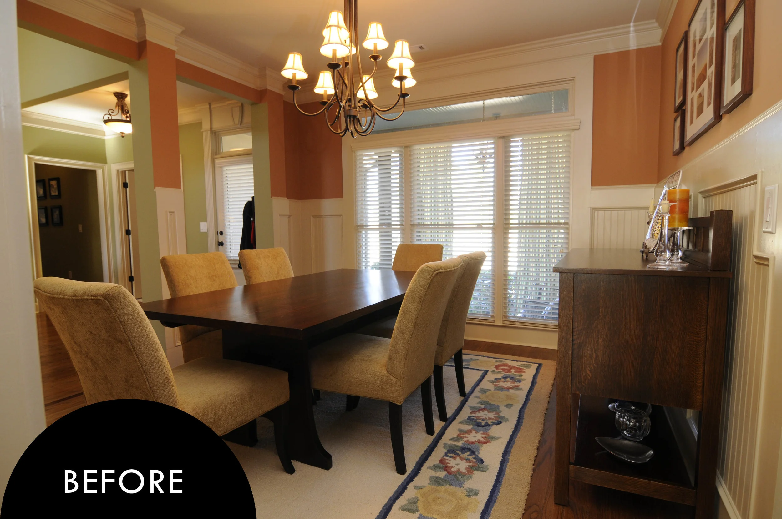


Sometimes you need to get a custom piece made to fit a unique space… and then sometimes Crate & Barrel makes the most perfect dimensions for a cabinet and you jump up and down clapping your hands in excitement. There's a very unique inset nook in the back corner of the dining area that seemed like it would require a custom storage solution, but I was really thrilled to find a piece that fit perfectly! From there, the space just needed updated chairs and accessories and it took on new life.
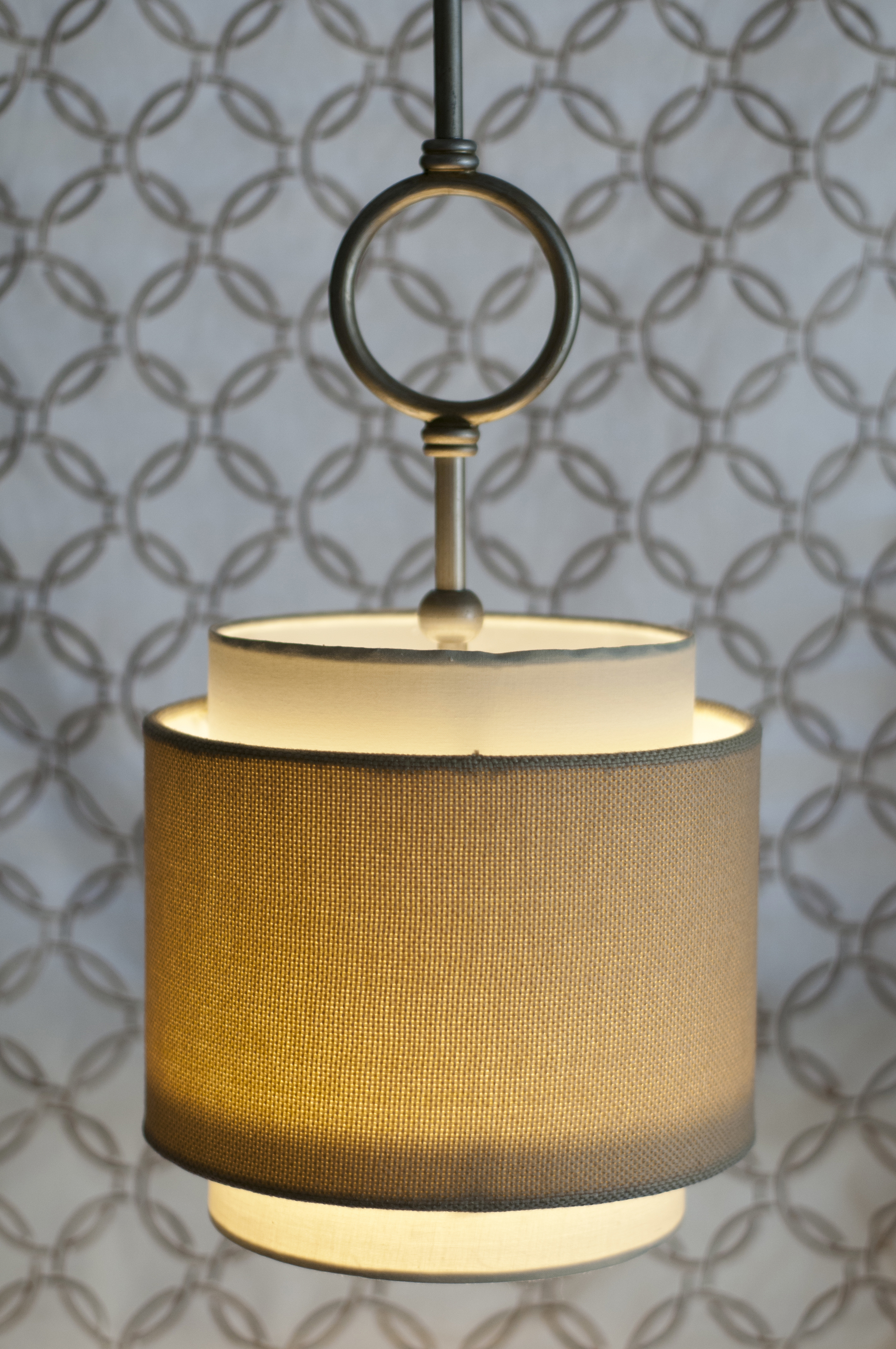
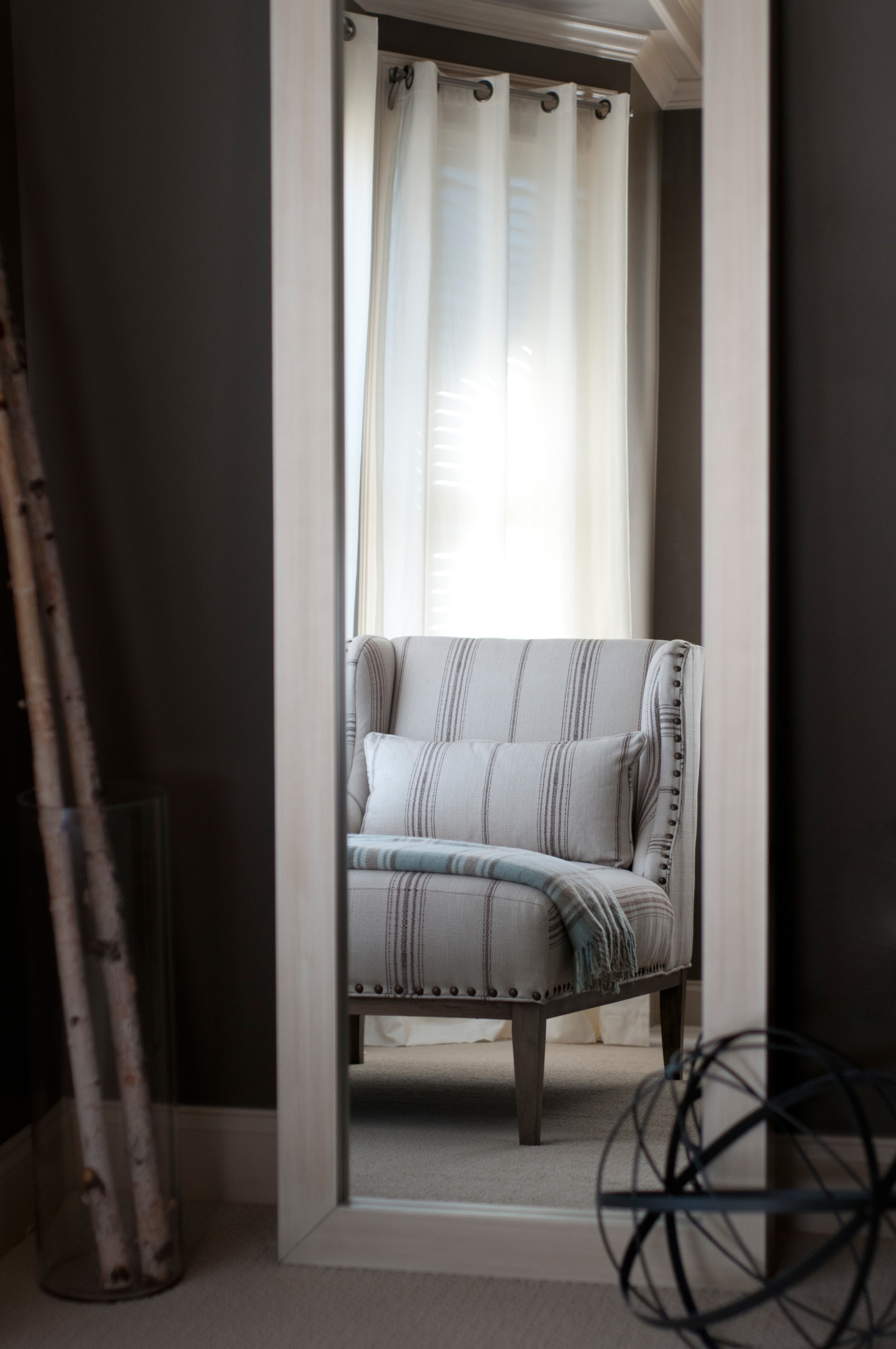
Ahhhhh… and here we arrive at the master bedroom. A peaceful oasis of soft neutrals and soothing turquoises. We wanted this space to feel peaceful, refined, and welcoming. Again we utilized the window space, this time with a custom chaise. Other updates were painting to highlight the architectural features of the ceiling and updating the accessories. One of my favorite details are the lights that we added over each night stand (another one of Kelly's brilliant ideas!) This freed up space on the night stand, but also added height and balance by bringing attention to the symmetry around the bed.