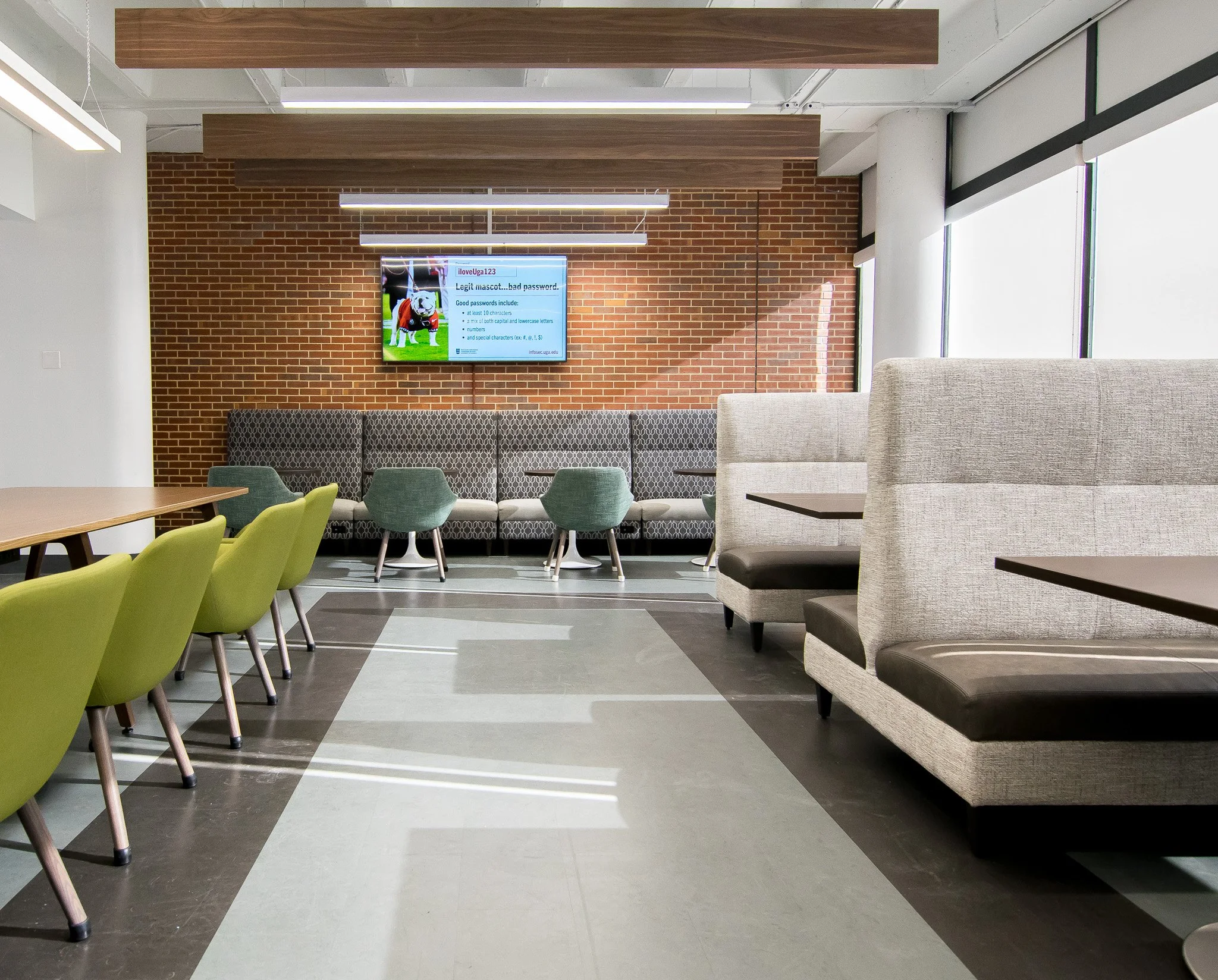
The University of Georgia College of Veterinary Medicine has a large academic building on campus. There are many classrooms and lecture halls, but just one main central hub for students to congregate, eat lunch, or study. When I “met” this space, it had such a variety of furniture pieces — telling the story of the evolution of the space over the years. There was a piano. A fish tank (quite appropriate for the vet school!) And a bulldog statue. It was also very cozy and felt like a haven from more utilitarian spaces. Our aim was to bring focus and purpose back to this space (without losing the cozy haven) and create a lounge area where students felt welcome to gather, dine, and study.
Communal table at UGA College of Veterinary Medicine
One of the biggest goals was to create a seating layout that offered a variety of interactions for students; but we also aimed to use types and arrangements of furniture that DISCOURAGED students from moving and rearranging the room. One of the sources of frustration from the original space was that students would move around the armchairs and sofas to create their own seating groupings… but that often left the room looking more chaotic and disheveled. We chose to create different seating zones - some offering more flexibility than others, to offer inviting seating for everyone— from a party of 10 to a solo studier. The entrance of the space offers a communal table while the back and sides are lined with banquettes. There are a few freestanding tables and chairs as well as. a lounge at the end with swivel seats and coffee tables. This space is adjacent to a kitchenette where students can prep their lunch, so having adequate dining tables was high on the priority list.
Little details helped give life to the space. The staff was intentional to select greens and blues that gave color and interest. And the fish tank got a refresh and found a good home in the center of the room. They make great study companions :-)
We were also able to update the Student Kitchenette space during this project. This area was closed off from the lobby and did not welcome students to use the amenities. By taking down a wall, this gave much greater access and allowed for new cabinets and appliances to be added. This space became much more usable and really flows well with the student lobby hallway.
Perhaps one of the most fun aspects of the project was to work within some of the existing building conditions to highlight its history.
We were able to expose the ceiling and paint it white. This not only added volume to the space, but made it feel much airier and open. The light ceiling also really accentuated the natural light coming from the back windows. We used an acoustic wood beam feature to give rhythm to the ceiling and add warmth to the space.
The brick side wall of the space is actually one of the exterior walls of the original vet school building (pictured above). It still had the openings and window sills from the old exterior windows. These spots were once just painted over but I felt like they begged to become art in the space. The geometry really worked well. We found some old photos of vet school students hanging out at a restaurant downtown to use as art— and it felt very appropriate for our lounge and dining space.
Aren’t the columns cool?! Those are original from the building addition in the 50s and it felt like a great retro vibe (and good budget move) to incorporate them into the space. They just got a coat of paint and were ready to go.
This was such a rewarding space to work on. It’s fun to think about all of the lives that pass through this space that will go on to make amazing discoveries and care for our pets. Glad we could give them a wonderful lounge space!


